Harvesting Success with a Distinctive Agriculture Brand
Results
Market-Driven Approach
Used competitor analysis and market insights to ensure the brand and product range align with farmer preference.
Striking
Visuals

About The Customer
Industry
Company Size
Services
The Challenge
In 2020, Allied Merchants Buying Association launched their Agri Category, identifying a significant opportunity to develop a new brand of milk replacer. With the market for milk replacers experiencing rapid growth and an influx of new competitors, the challenge was to create a brand that not only resonated with farmers but also conveyed high quality, scientific precision, and a sustainable approach. The brand needed to stand out in a crowded marketplace, where decisions are often driven by price and product specification.

The Solution
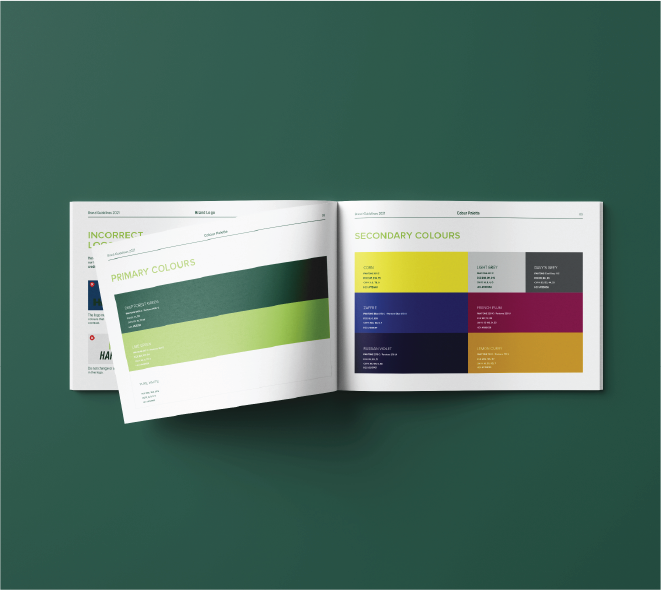
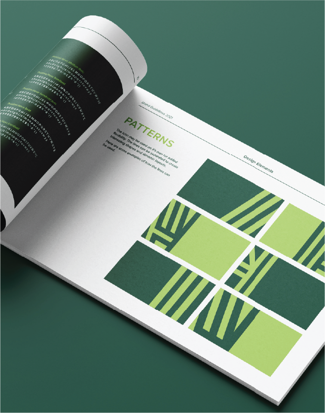
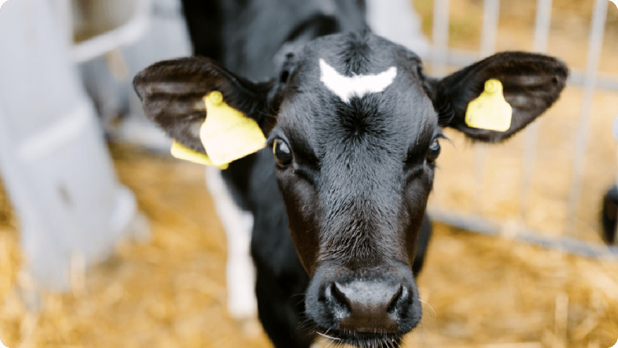
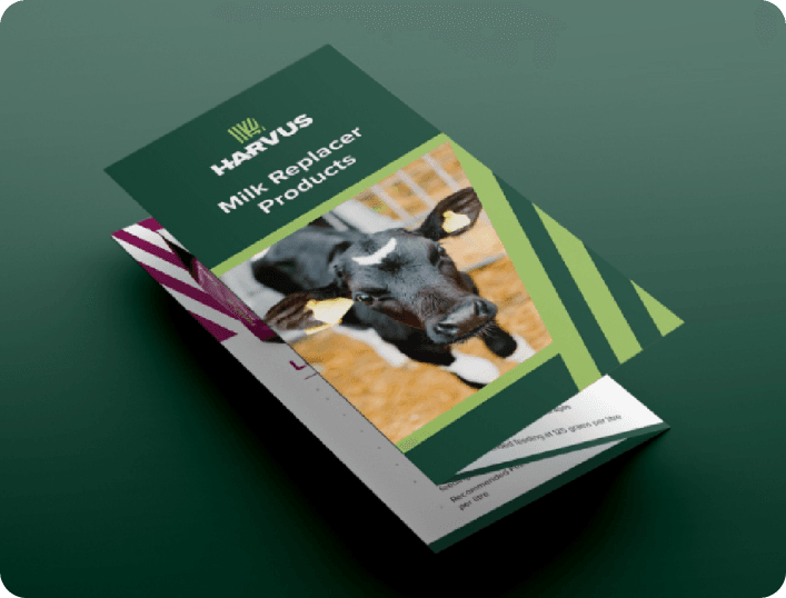
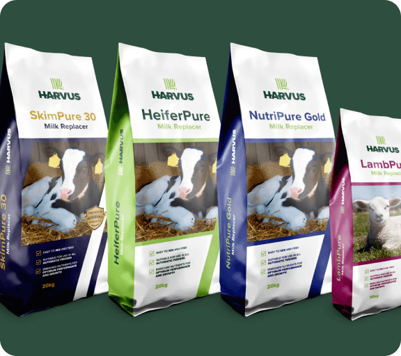
For the packaging design, we created four distinct layouts for the key products in the milk replacer range. By separating the lines of the icon, we developed dynamic spaces to feature imagery of the animals, ensuring that each product’s unique specifications were clearly communicated. A broad and bold color palette was selected to differentiate the products visually, making it easier for farmers to identify the specific product that best meets their needs.

We enjoy working with The Smart Group! They consistently deliver creative solutions to a high standard, and are excellent at working to deadlines. We have worked with The Smart Group over a number of years on a variety of projects from high quality publications to brand development and packaging and have come to rely on excellent service and output.

The Results
The brand identity design for Harvus contributed to Aislinn McGrath being nominated as Europes Top 3 Young Contenders of the Year at the Transform Europe Awards.

View More of Our Work


